 |
|
Spotlight Our widgets for functional genomics use Orange, a data mining
and machine learning suite. Orange can be accessed through scripting in
Python,
or by visual programming in Orange Canvas. |
| FRI > Biolab > Supplements > Microarray Data Mining with Visual Programming > S. cerevisiae Example > Heat Map widget | |
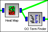
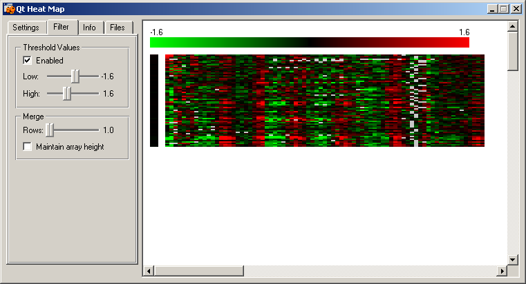
Heat Map widgetHere we display the genes with a peak in expression in M/G1 phase that were selected with the "Scatterplot" and "Scatterplot (2)" widgets. The time points defining the columns were taken directly from the results of Spellman et al. (1998) and they represent time course gene expression measurements of four differently synchronized yeast cultures. Thus, each cell cycle phase is represented several times in the expression profile of each gene.
|
|

