 |
|
Spotlight Our widgets for functional genomics use Orange, a data mining
and machine learning suite. Orange can be accessed through scripting in
Python,
or by visual programming in Orange Canvas. |
| FRI > Biolab > Supplements > Microarray Data Mining with Visual Programming > D. discoideum Example > Heat Map widget | |
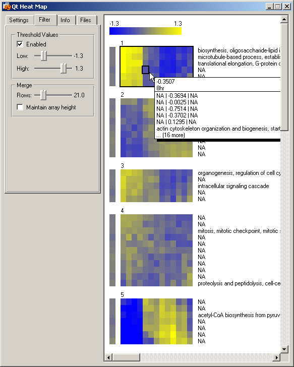
Heat Map widgetThis widget provides means to present the results of the k-means clustering. Details assigned to genes in the input data file can be displayed. In our example, we display GO annotations. With the "Merge" options we can set the level of image granularity. In order to display all genes on screen and get a better overall picture, we have merged groups of 21 genes (rows, option Merge->Rows) and displayed their average expression as single rows. Moving the mouse over a specific time point and row displays details about all the genes in a row. Clusters "1" and "5" are similar to the ones discovered in (Van Driessche et al., 2002). There is a dramatic change in expression between 6-8 hour in both groups. Genes in cluster "5" have a lower-than-average expression during growth and early development (0-6 hour) and a higher-than-average expression in later times (8-24 hour). Genes in cluster "1" have a higher-than-average expression during growth and development (0-6 hour) and a lower-than-average expression later in development (8-24 hour). Further analysis with the "GO Term Finder" widget will show the presence of genes associated with cysteine protease and vegetative ribosomal genes. This concords with the findings in (Van Driessche et al., 2002). We have selected all genes from cluster "1" for further analysis. These genes are sent as a new data token to the four linked widgets: "Scatterplot", "Heat Map (2)", "GO Term Finder" and "Genome Map."
|
|

