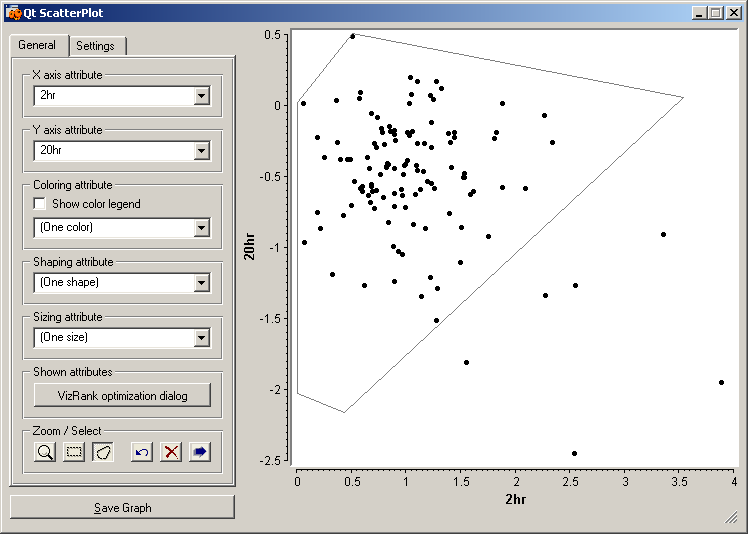
Data selected in the "Heat Map" widget are displayed in this widget as a scatterplot. The expression data in two selected time points (2 and 20 hour) are displayed. We have selected a region (polygon) of expression for further visualization. The selected data are grouped into one class, the unselected data in the other and send out to the "Expression Profiles (3)" widget.
